Buttons are everywhere on the web because most of the devices work on touch and tap techniques to capture the customers. Just like we switch on television at home to act, a call-to-action button is used to catch the attention of website visitors and push them to perform a specific action.
So, you have spent a lot of time in designing your B2C e-commerce website, tweaking the content, and ensuring that everything goes well on the website. Why store advertisements are also not converting the traffic? Why visitors are not shopping from your website?
Can’t find the reason?
Probably, your customers are having difficulty navigating throughout the store or they cannot find the call to action button that nudges them towards checkout on a B2C e-commerce website.
Let’s begin at the beginning and try to unravel the mystery of these buttons. Ready to go?
Table of Contents
So, what are Calls-to-Action buttons?
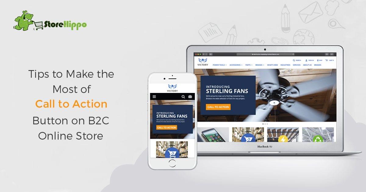
A call-to-action button can be plain text or a combination of text and image, that tells a line of action to your audience. For example, you might want a reader to subscribe to your blog or newsletter at the end of blog posts. A call-to-action guides the customer to take the right action and move towards the conversion. But placing the right call-to-action (CTA) on the right page at the right time requires a keen strategy for a B2C e-commerce site. because you have to engage the customer without compromising the existing relationship you have built with them.
Let's check some Quick Examples of Call-to-Action buttons
- Add to Cart
- Subscribe to our newsletter
- Activate your account
- Claim your offer
- Join today
- Buy now
- Get an instant discount of X%
- Start your journey now
- Get your free product
- Start the quiz to win offers
- Add to wish list
- Want more information?
- Reserve your seat now
- Sign up today
Psychology Behind CTA
The majority of us tend to grab the best value and that is the psychology behind CTA phrases. For example, the sense of urgency in words like "Now", "Today" instantly catches the attention of users because they tell the clear action to the readers. From television commercials, hoardings, brochures to social media, everything includes a Call-to-action because it is way more definitive and guides the reader in the best possible manner.
CTAs work perfectly on the internet, not only because consumers can click them with a single click. There are many elements that have a psychological influence on the customers while shopping from B2C ecommerce websites like fonts, colors, and other visual elements. Even the placement of CTAs has a psychological context and impacts sales conversion.
CTA is a bridge between the interest of the visitor and offering a better value to them. It can be a link, button, image placed strategically on the website to convert prospects into customers. Converting customers requires an integrated marketing solution specially designed for ecommerce. The customized ecommerce marketing solutions with a gamut of inbuilt marketing features and tools are one of the best ways to boost sales, achieve higher traffic and conversions. The top e-commerce platforms like StoreHippo provide integrated ecommerce marketing solutions and help grow your business in a hassle-free manner.
Drafting, placing and making an effective CTA is not an exact science but there are a few tips and best practices that can help.
5 Tips to create and use a Call-to-action button
1. Keep the design simple
Many people put a lot of effort to make the CTA stand out but it could be a major mistake because the visitors get attracted to simple phrases with few designs and effects. Many studies are also conducted to evaluate the performance of landing pages across different industries. The test was conducted among 90 different CTA buttons and it was found that the simpler designs have better results as compared to relatively complex designed buttons. The most performing colors of the button are red, orange, green and blue surrounded by neutral colors like white, grey, black. The simplicity of the CTA buttons catches the attention of users because they are easily understandable and readable. Well, keeping it simple does not mean to make it boring all the time because the users do not expect boring things on a B2C e-commerce website. You can give slight changes with great colors, attractive copywriting, classy designs. Just don't overdo it.
2. Make your CTA button stand out
Most of the site owners spent hours in testing the font, design, colors, and other related aspects of CTA buttons but the copy plays a much bigger role in attracting the users because the decision to click is based on the copy.
There is no exact thumb rule to be followed while writing a CTA copy but there are many effective words that stand out. Some of them are:
- Learn
- Join
- Discover
- Explore
- Start
- Build
- Stop
- Free
- Results
- Save
- Guarantee
- Proven
- New
All these words are very popular and work very well on B2C ecommerce websites. There is a common thing about all these words, they all imply action and provide some kind of benefit to the user. Of course, it is equally important to strategize the words followed by these verbs. It will tell the users what they can get by clicking on the CTA button.
Another important point is the placement of the CTA button, as it should have proper visibility and in their direct path.
3. Make the CTA as "The next step" for users
CTA buttons are meant to generate leads, drive sales, increase revenues for business and they should never compete with other less important pages on the website. It means that the CTA button needs to be the most important, obvious and attention-grabbing factor on the site to generate leads and convert customers. There can be multiple CTAs on the B2C ecommerce website but every button should have a separate identity and class. It should attract the visitor in a way that no user can ignore it. When users are compelled to take any action through the button, the job is done because it moves the users closer to sales conversion.
As mentioned earlier, the placement of the CTA button is very important and on the same node, CTAs should be in closest proximity to the informative copy on the website. While designing the web pages, the site owners should always aim to place the button close to the previous action. The gist here is to place the CTA buttons in the path of the user's eyes so that it becomes very easy for them to click. It becomes easy to do it when you design your B2C ecommerce store and CTAs while keeping the user flow and behavior in mind. As a result, you will make it easy for the users to take action and maximize the possibilities of conversion.
4. Make it Time-specific / Sense of urgency
The user mindset works the most when it is about the performance of CTA buttons. Creating a sense of scarcity or urgency is another successful tactics as it converts the customers as quickly as possible. Not everyone will become the potential leads but there are much higher chances of generating a lead or making a sale when there is an urgency to take action.
An excellent example here is StoreHippo, it talks about their B2B and B2C e-commerce solution services, and invites the customer to "Try Now' or "Schedule a Demo".
Many other time-specific CTA phrases support in generating more leads and accomplishing the sales. Some of them are:
- Hurry
- Closing Soon
- Last Chance
- Limited Stock
- Valid only for X days
- Offer ends in X days
- Immediately
- Only for Today
5. Convince the customer with the given value
One of the most important decisive factors for users is "Value". If they are convinced with the value they are getting, the CTA button on B2C ecommerce store becomes way more appealing for them. One of the most commonly used phrases in this context is "Free" as you invite the website visitors to get something valuable without any cost. It can be anything that provides value to the user like a cheat sheet, free templates, toolkits, etc. Well, you are not giving all these things for free because these lead magnets will fetch a lot of prospects.
Sometimes, even "Free" word does not attract B2C ecommerce customers because many consumers consider free giveaways as valueless. You have to prove them with a catchy phrase like "Get a Free eBook to boost your sales and get more clients". The value can be proved only through the description. When you give your knowledge and time to consumers, there is always a possibility that they reciprocate by giving sales to your business.
Wrap up
Practicing the listed ways can help you leverage your efforts in crafting effective CTAs and better sales for your B2C ecommerce store. In addition to these tips, the top ecommerce platforms like StoreHippo provides powerful features to convert maximum customers on the website. It allows you to get device-specific themes, craft and place CTAs strategically and optimize the overall look and feel of your online stores.
So what are you waiting for? Use the above tips to design your own CTA buttons and let us know how it worked for your B2C ecommerce business.